0% Points
Back to home
Case study — Demerara Bank01 / 11
Case study

Demerara Bank: A Unified Web and Mobile Banking Experience
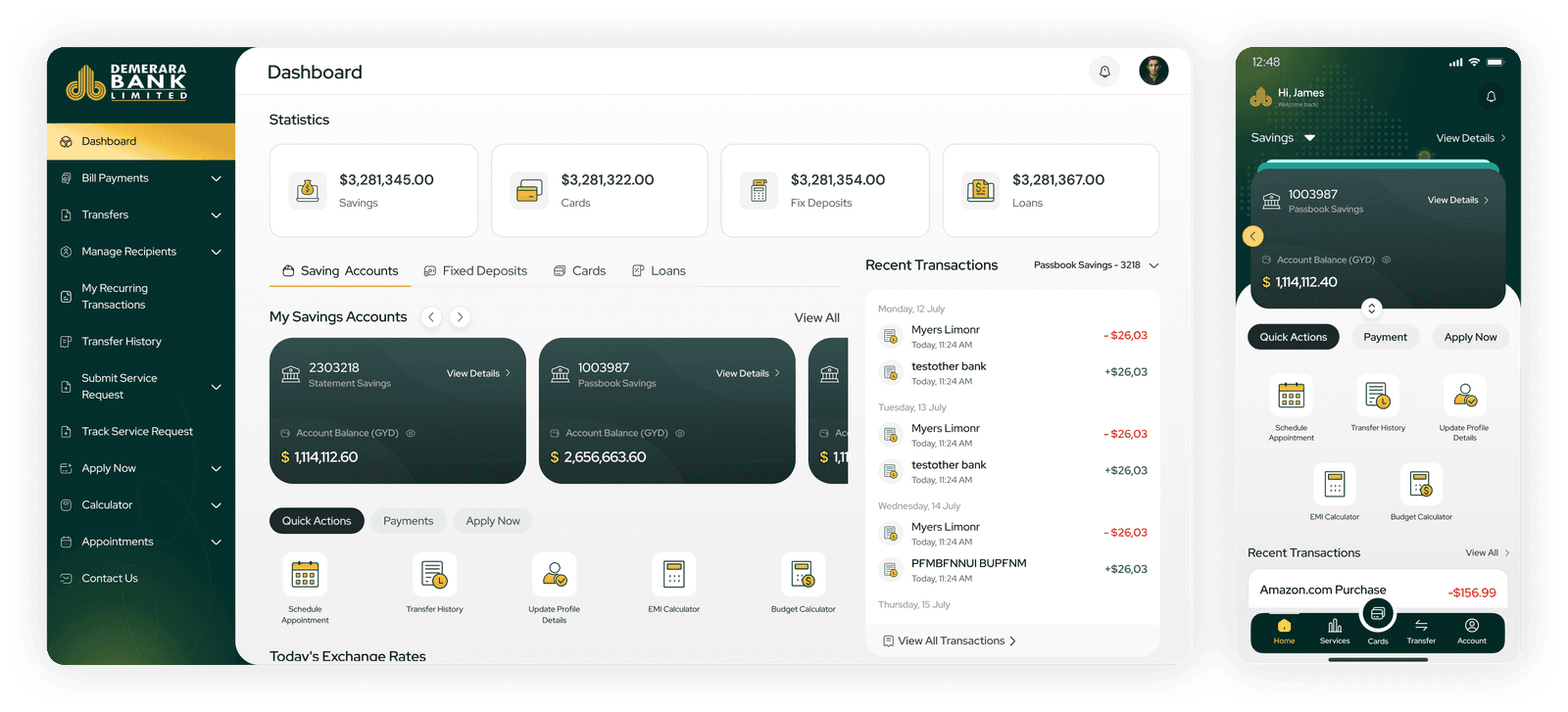
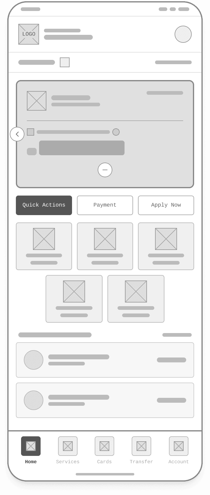
Evolving a legacy bank into a digital-first experience — 62 screens in 7 weeks, app and web on one shared design system.

Sanju VishwashDemerara Bank
Demerara Bank
Case study — Demerara Bank02 / 11
The brief

What this was, and what I ran

🏢
Organisation
Demerara Bank
👤
Role
UI/UX Designer
📅
Duration
7 Weeks
🛠
Tools & Technologies
UX ResearchWireframingUI DesignDesign System
Sanju VishwashOverview
Case study — Demerara Bank03 / 11
The context

The problem I was handed

Two problems, one root. Customers couldn't bank digitally without hassle. Routine tasks still meant a trip to the branch. And the bank's existing system couldn't scale to a modern interface. Going into 2026, 81.7% of Guyanese were online, 684,000 people ready to bank digitally, yet no app let them do it without friction. Meanwhile 72.5% live rurally, far from a branch, and roughly 4 in 10 adults have no bank account at all.

Sanju VishwashProblem
Case study — Demerara Bank04 / 11
In the work
Sanju VishwashScreens
Case study — Demerara Bank05 / 11
My role

What I owned

End-to-end UI/UX across both products. Desktop revamp: 24 screens in 3 weeks, the existing web banking system rebuilt on a modern, scalable design system. Mobile app: 38 screens in 4 weeks, a new iOS and Android app for everyday banking, designed mobile-first. Research, audit, personas, affinity mapping, information architecture, wireframes, style guide and final UI.

Sanju VishwashMy role
Case study — Demerara Bank06 / 11
The outcome

What it moved

+60%task completion
−35%support queries
+90%user trust and confidence
Sanju VishwashOutcome
Case study — Demerara Bank07 / 11
The process

How I got there

Desk research reframed the brief before any design started. Guyana going into 2026 was 81.7% online with a median age of 26, a mobile-first country. The appetite was already there. What was missing was a bank that met it.

The current-experience audit ran across 9 interviews and a 412-response online survey, alongside research Demerara Bank shared with the design team. Asked what was most frustrating about banking with them today, people answered consistently:

34% going into a branch for routine tasks
28% juggling separate logins for accounts and cards
22% living rurally, far from a branch
16% waiting on applications with no way to track them

Maria, a salaried professional: “It looks old, so a part of me doesn't fully trust it with big transfers. I'd rather go in.”

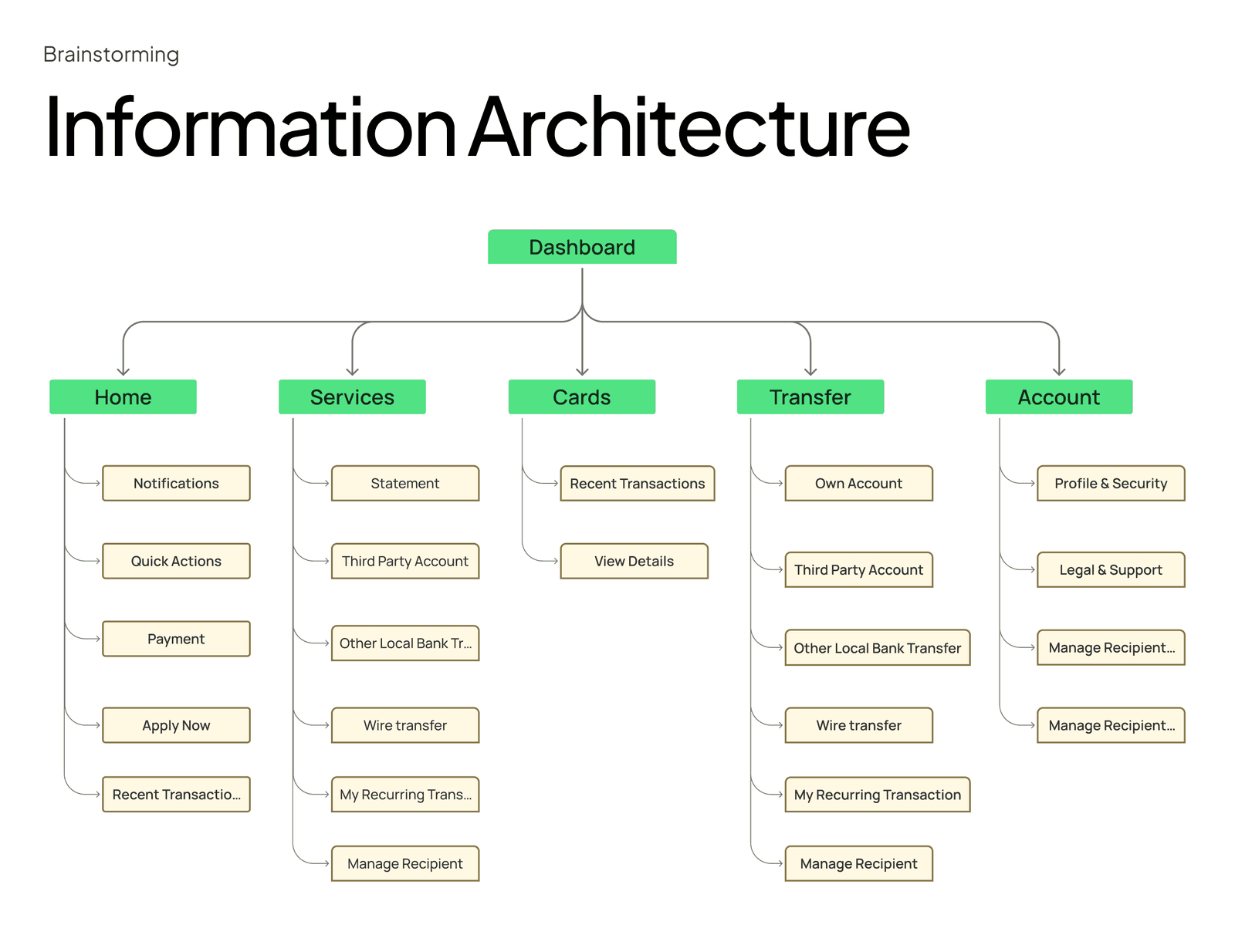
The SWOT made the brief obvious. Demerara already had real transactional depth (20+ services, transfers, loans, deposits, wires) and the trust of an institution serving Guyana since 1994. What it had instead of a product was three web portals plus an app, with separate logins for personal, corporate and cards, a dated dense interface, and paper-bound onboarding. Weaknesses plus opportunities equalled the brief.

Biggest lever: one login, one system. Trust must be visible, not assumed.

Two personas kept scope honest: Priya Persaud, 34, a small-business owner who needs personal and business banking in one app without branch trips, and Shanice, 27, a nurse who banks in a few taps between shifts and needs to know the transfer went through.

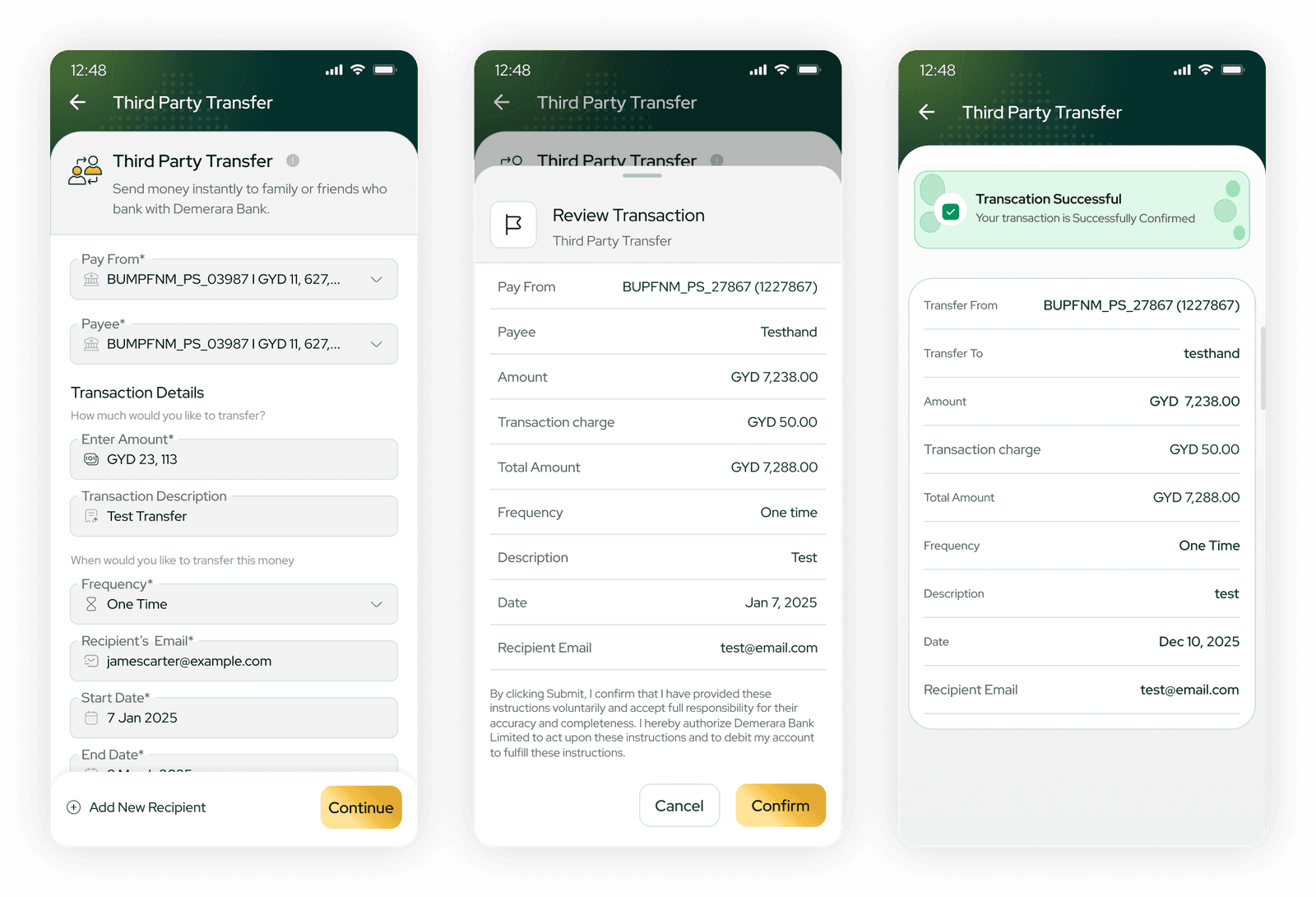
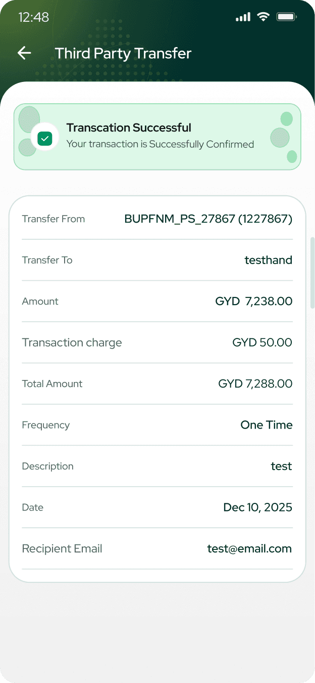
Affinity mapping reduced everything to three user needs, each with a direct solution: reach any task in as few steps as possible → a shallow IA with quick actions up front; know for certain a payment went through → designed loading, filled and confirm states across every money-movement flow; feel money and data are safe → a premium visual language with visible security cues.

Those became four product goals: simplify the routine, reduce cognitive load, build visible trust, unify the ecosystem. Every screen was checked against them. The style guide was built from Demerara's own colours: Demerara Green #004E32 for trust, Growth Green #00A155, and Heritage Gold #D09106 for premium moments and key actions. Red Hat Display runs throughout. Its distinct figures keep balances readable and it holds up at small sizes on budget phones.

Sanju VishwashHow I solved it
Case study — Demerara Bank08 / 11
In the work
Sanju VishwashScreens
Case study — Demerara Bank09 / 11
The solution

What shipped

Banking anywhere, anytime: Demerara's own promise, now in every customer's pocket.

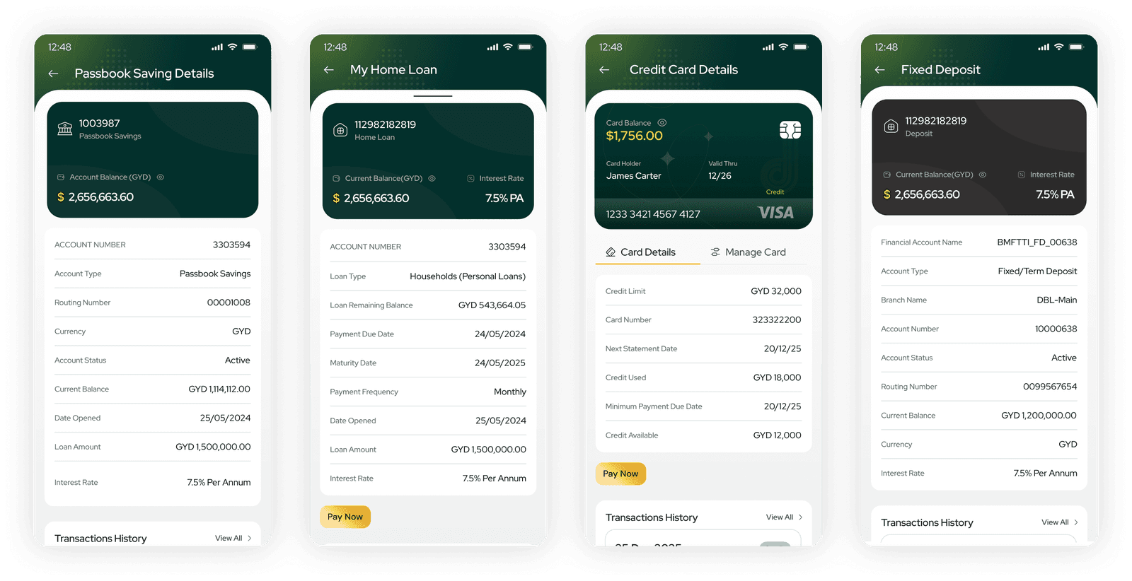
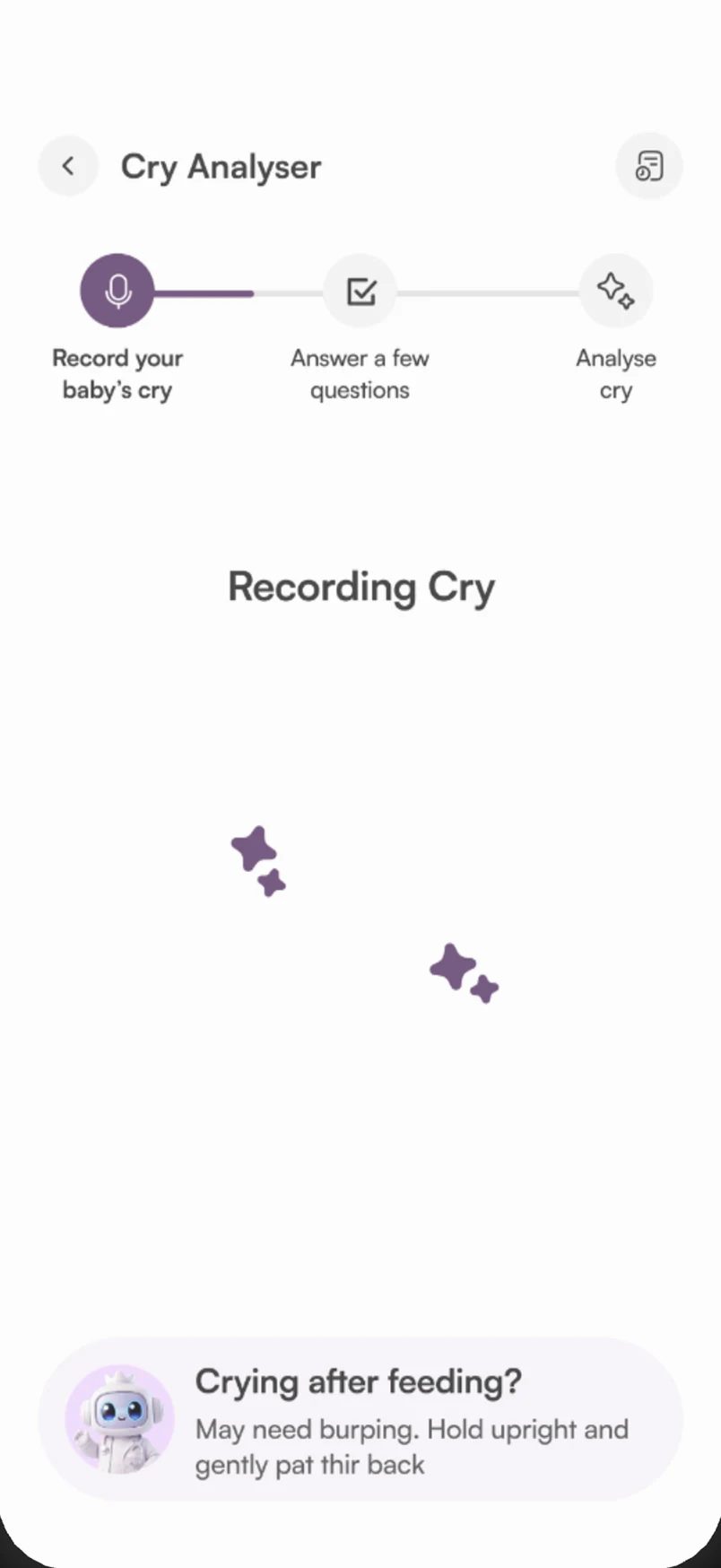
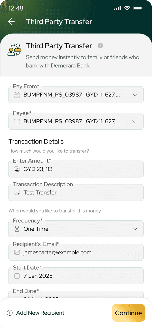
A mobile app and a revamped web experience sharing one scalable design system, across four solution areas: Dashboard & Home, Accounts at a Glance, Moving Money, and Self-Service & Tools: EMI and budget calculators, service requests and appointment booking.

The redesign delivered measurable gains against exactly the problems it set out to solve:

60% increase in task completion. Transfers, bill payments and account tasks are faster to finish.
35% reduction in support queries. Clearer navigation and real-time status cut repeat questions.
90% improvement in user trust and confidence. Visible security and a modern interface raised it.

The task was to turn Guyana's digital momentum into a banking experience people actually trust. The timing matters: a national payment platform was called for in March 2026 and FAST PAY real-time payments were announced for June 2026. The bar for digital in Guyana is rising, and customers compare their bank to their best app, not only to other banks.

Sanju VishwashWhat shipped
Case study — Demerara Bank10 / 11
What worked

What worked

Leading with desk research: the 81.7%-online figure turned this from a redesign into an urgent one. Reducing all the qualitative research to three user needs, so every later decision had something concrete to be checked against. Keeping the information architecture shallow rather than comprehensive. Designing loading, filled and confirm states as carefully as the forms themselves, because certainty is where trust is actually won. Building the palette from Demerara's own green and gold instead of importing a generic fintech look.

Sanju VishwashWhat worked
Case study — Demerara Bank11 / 11
Next time

What I'd do differently

Usability-test the transfer flow with real customers in Guyana rather than validating internally. Scope the legacy system's constraints earlier, because some interface decisions had to bend around what the platform could support. Design for FAST PAY real-time payments in v1 instead of treating it as a later addition. Test legibility on genuinely low-end devices, not just scaled-down desktop previews.

Sanju VishwashWhat I'd do differently

// Case studies

More work

Tap a card for the full story

// Let's talk

You seem cool, let's connect?

Want the thinking behind this one?

Hiring for a design role, or have an idea that needs shaping? Drop me a line. I read every message, and I reply to all of them.